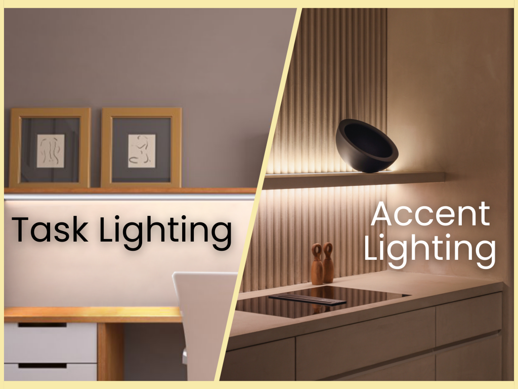
MOD was a major supplier of lighting products under its original name, National Lighting. In recent years, MOD has expanded most notably to advanced charging solutions but still offers a variety of task and accent lighting solutions. In this article, we will familiarize you with the differences in color temperature to simplify your selection process. Check out this article to ensure you pair your lighting with the right transformer.
The Kelvin Scale Explained
The Kelvin scale is the universal description for variations in light color temperatures ranging from 1,000 to 10,000 denoted by “K” or Kelvin. For example, our task lighting series ranges from 3000K to 6000K. A lower number indicates a red or orange hue and is usually described as a warmer color. In comparison, a higher number indicates a cooler temperature that tends to appear more white or blue. It is important to understand that lumens describe the intensity or brightness of the light as opposed to the color. For instance, a light closer to red/orange could be just the same in lumens as one that is more blue. For reference, we have included a graphic to display color temperatures below:
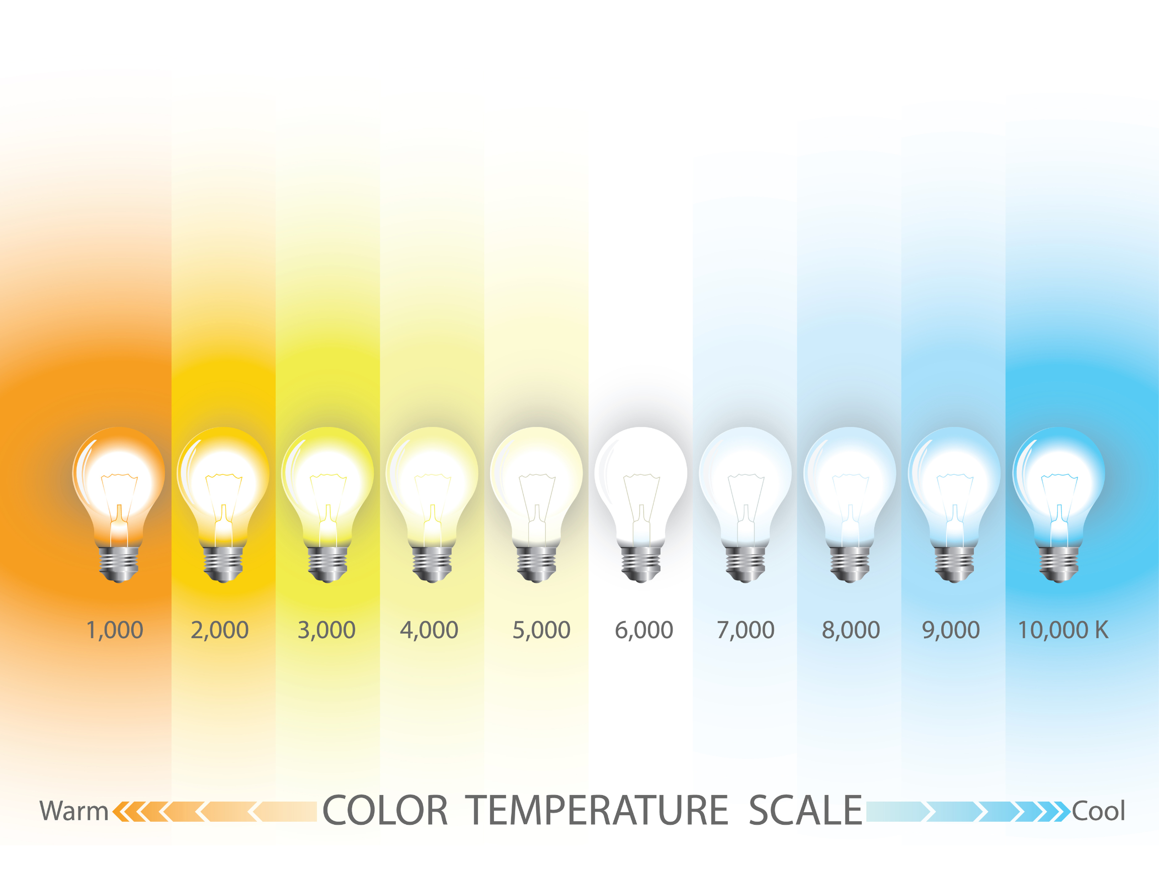
After 6000K the light starts showing distinct signs of blue, in our task lights, we do not offer above 6000K. This distinctly white color temperature is often referred to as Daylight White as it is one of the whiter saturated colors and is before a hue that is noticeably blue and after one that is slightly more yellow. In contrast, lights around 3000K are still considered White, but it is called Warm White to distinguish between its typically brighter counterpart. At around 3000K fixtures will emit light like the tone of sunrise or sunset. Near about 1000-2000K is like the color of candlelight. For additional perspective, check out the article from Shutterstock with some helpful graphics to grasp the differences in color temperatures.
The Best Applications of Each Color Temperature
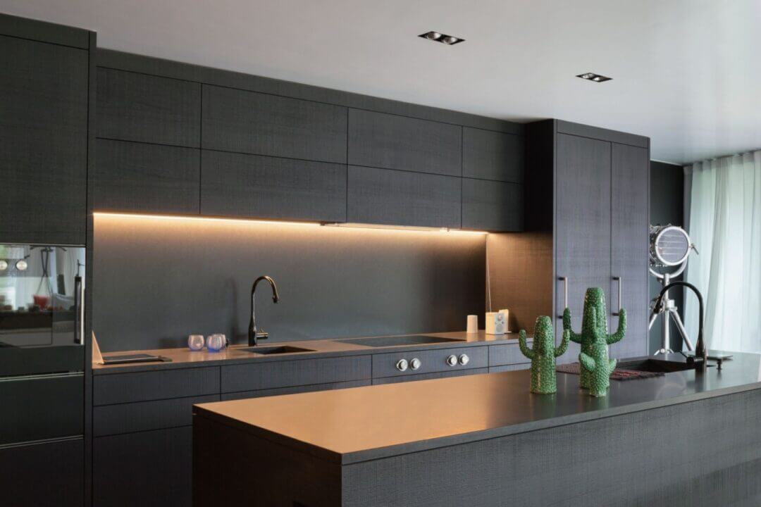
Starting with Warm Colors, around 2700K-3000K, these are best used in living rooms, bedrooms, dining rooms, and hospitality settings. The Warm Color inspires a sense of comfort in an inviting atmosphere typical for a residential hospitality space. Neutral Color is generally described as around 3000-4000K and is best for kitchens, bathrooms, and office spaces where finer details are easier to make out but still tend to have a closer to red or orange in color temperature than daylight. Neutral Light provides a happy medium between visibility and comfort. Finally, Cool Color temperatures are best for high-focus environments such as workspaces, art studios/galleries, retail, and medical facilities. A cooler color temperature allows the viewer to see a higher level of detail since the whiter light illuminates and does not wash out the natural colors in the environment, allowing more clarity.
The right color temperature is up for interpretation in reality, but we put this article together to give context and historical usage cases. That way, you can make an informed decision about what the best color temperature is for your project. To explore some of the lighting products offered in a variety of color temperatures, check out our LED Lighting.

